FluxTrade
Multi-Asset Trading Mobile App
TradeFlow is a conceptual iOS mobile platform designed as an end-to-end product exploration in the fintech space. In this project, I worked as Product Designer, defining the UX strategy, information architecture, and full UI system to create a scalable ecosystem that enables users to trade stocks, crypto, forex, indices, and NFTs within a unified interface.
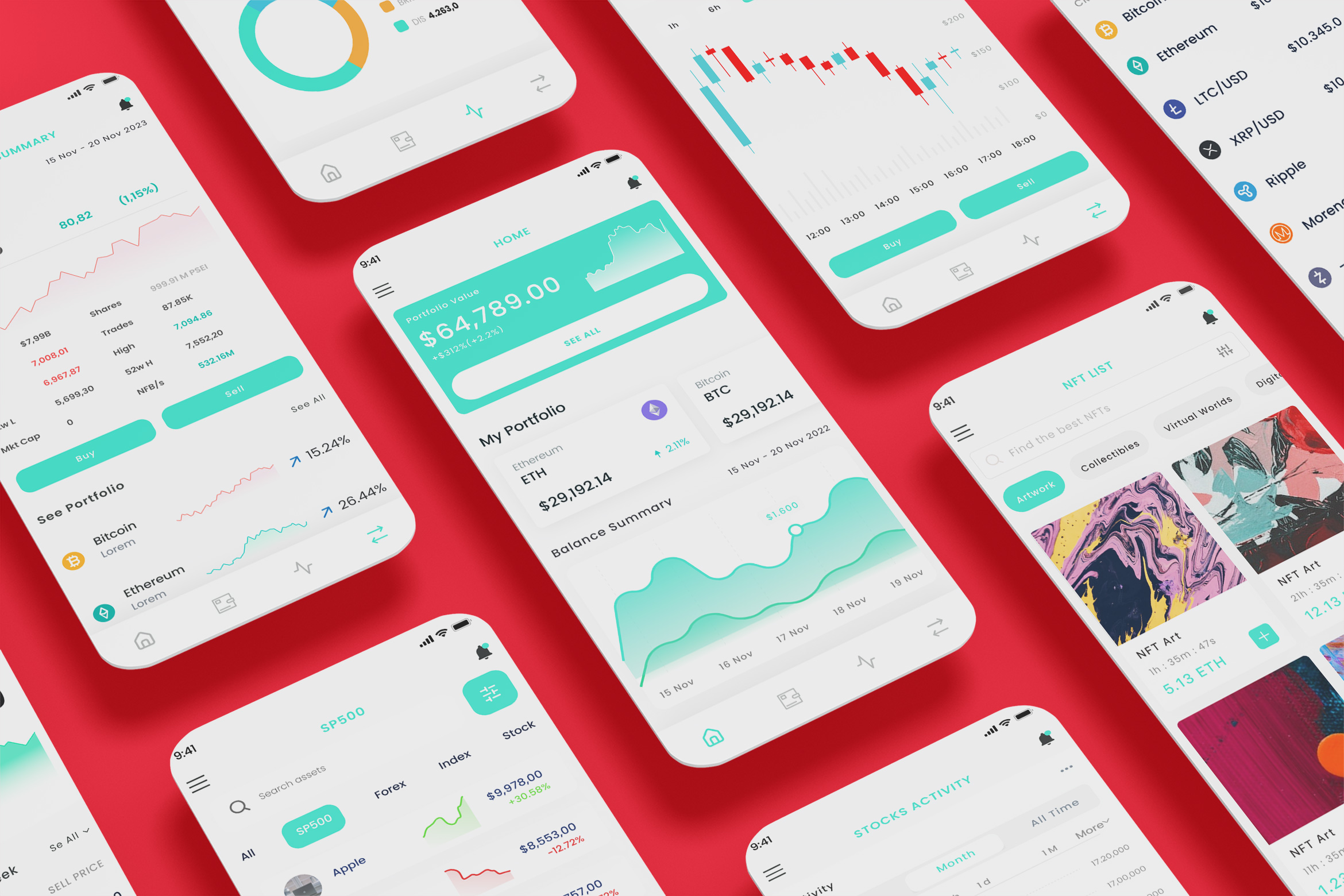
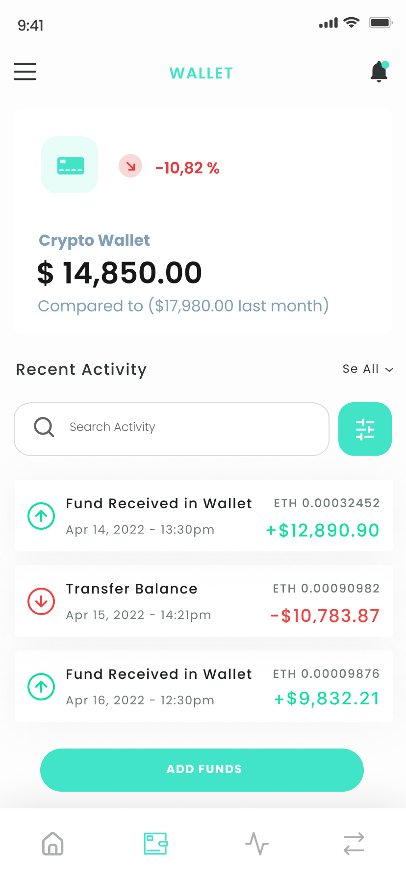
The platform integrates portfolio tracking, real-time market data, asset discovery, wallet management, crypto exchange, NFT marketplace interactions, and transaction history into a single structured experience. The core challenge was to balance data density, transactional flows, and asset diversity without overwhelming users or compromising clarity.
The result is a modular, extensible mobile trading experience designed to support both beginner investors and active traders while maintaining intuitive navigation and a cohesive, performance-driven visual identity.
Creating a Unified Experience Across Stocks, Crypto and Digital Assets
The Problem
Many trading apps specialize in a single asset class, such as stocks or crypto, while others attempt to combine multiple markets without a clear structural hierarchy. This often results in cluttered dashboards, inconsistent trading flows, fragmented wallet experiences, and overwhelming data presentation.
Users are frequently forced to navigate between separate modules for portfolio tracking, asset discovery, and transaction execution, leading to friction and cognitive overload — particularly for new investors.
Design Goals
The main objective was to design a modular trading architecture capable of supporting multiple asset classes within a single scalable system. The focus was on clearly separating asset categories such as stocks, crypto, forex, and NFTs, while maintaining consistent interaction patterns across buy, sell, and exchange flows.
The interface was designed to reduce decision friction in high-stakes financial actions, improve data readability, and build reusable UI components that allow future expansion into additional asset types or financial tools.
Target Users
The platform was designed around two core user profiles.
The primary user is a retail investor who trades across multiple asset classes and requires quick access to portfolio performance, real-time data, and efficient execution flows.
The secondary user is a beginner investor entering the trading space, who needs structured navigation, simplified asset discovery, and confidence-building interaction patterns during transactions.
Key User Flow:
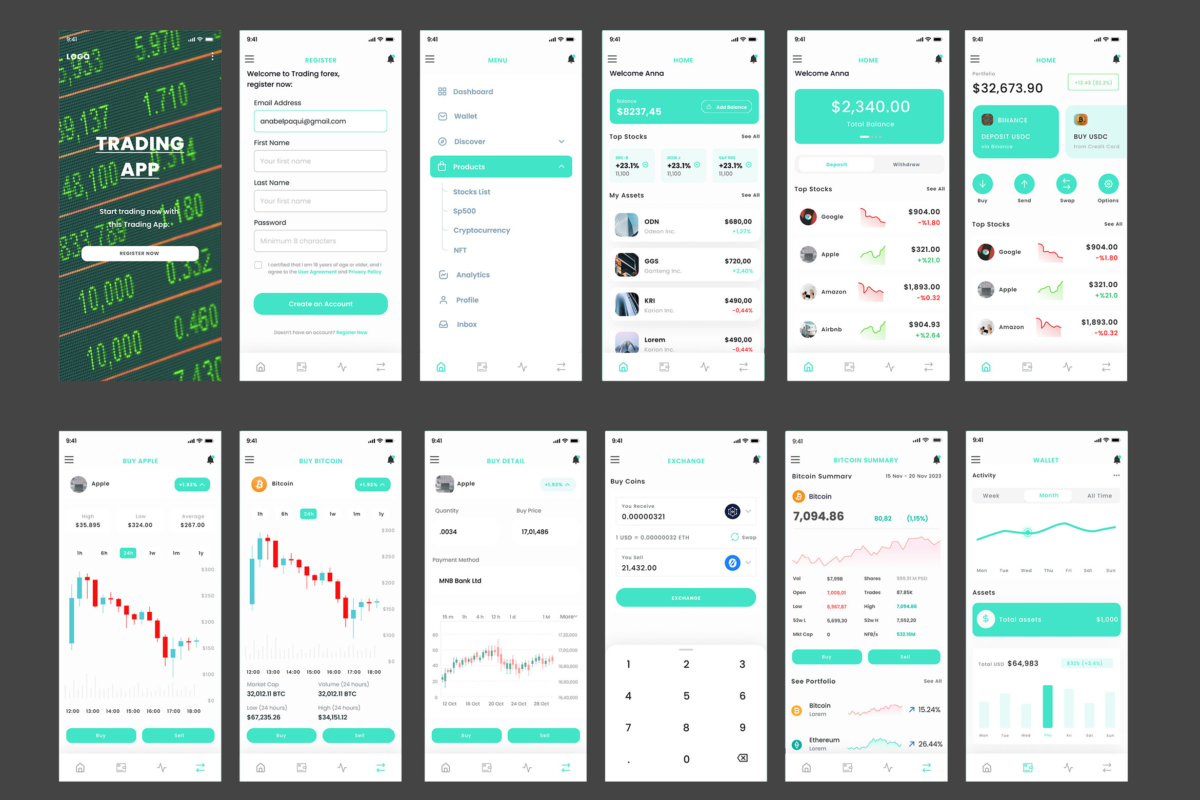
Buying an Asset
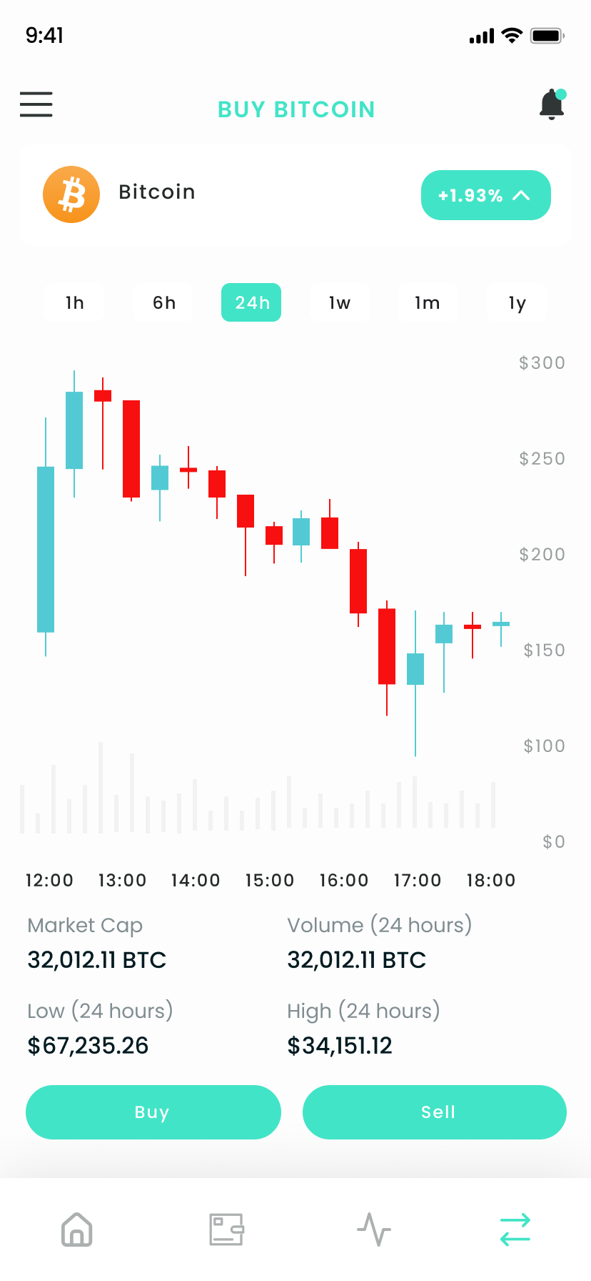
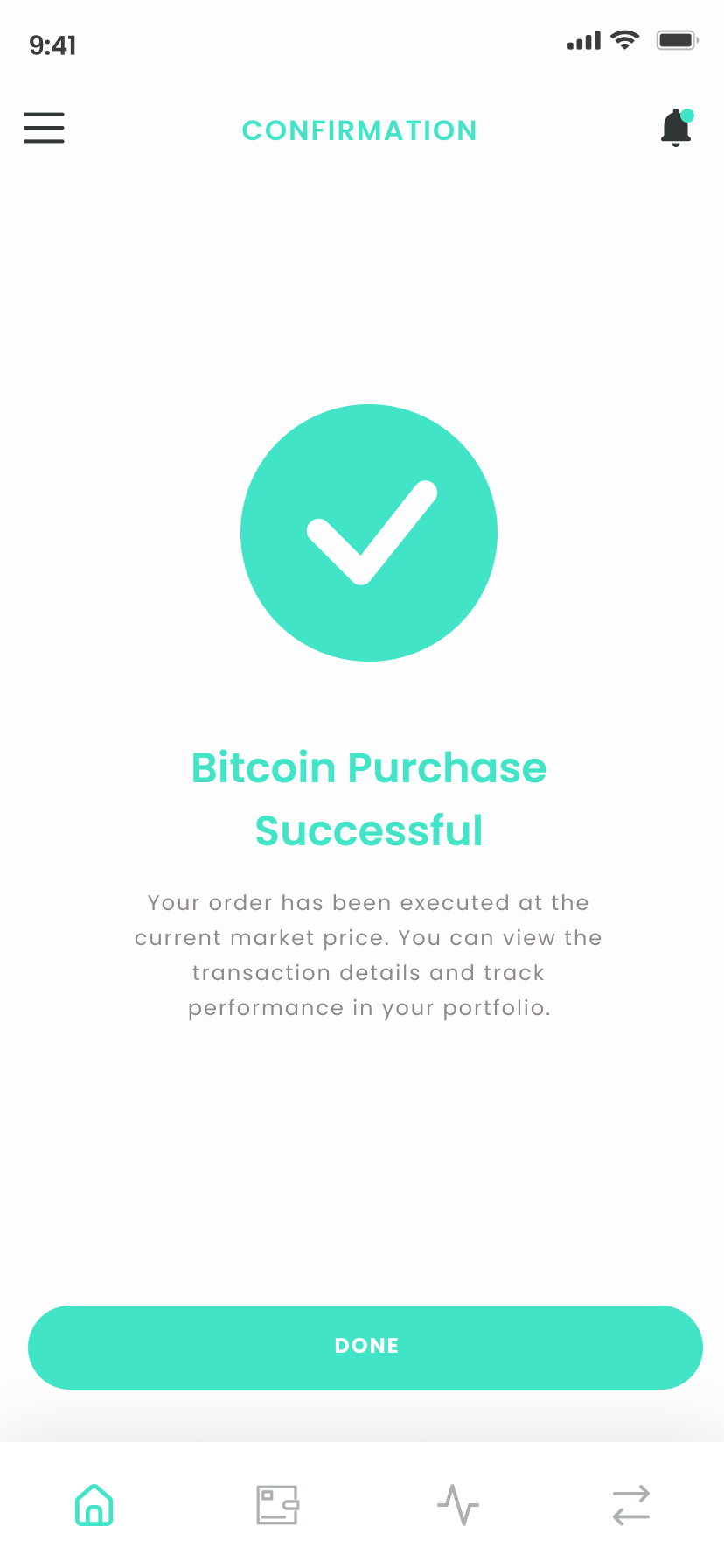
The trading flow was designed to guide users from asset discovery to transaction confirmation in a clear and controlled sequence: Home → Asset List → Asset Detail → Buy → Order Confirmation → Portfolio Update.
The flow prioritizes data clarity through structured price information, timeframe filters, performance indicators, and strong CTA hierarchy. Each step reduces uncertainty while maintaining transparency around pricing, wallet balance, and transaction details.
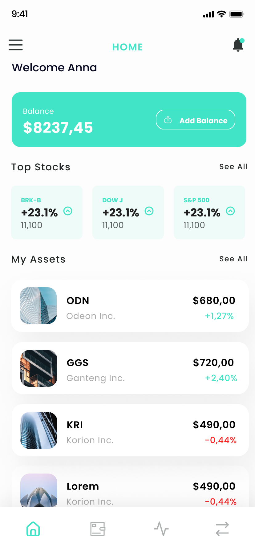
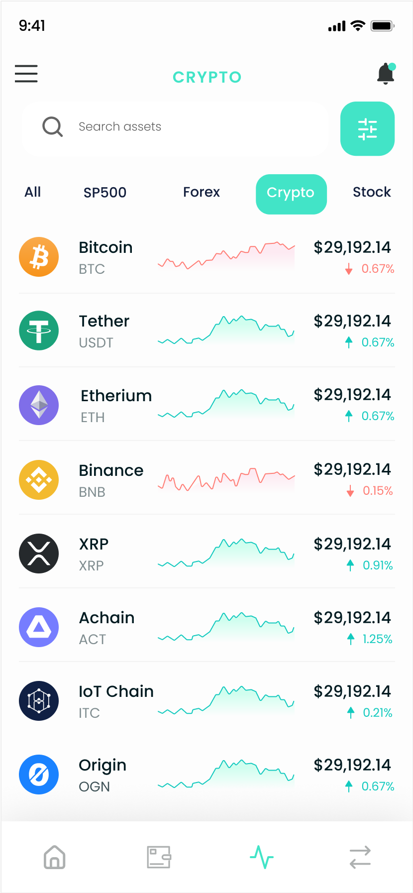
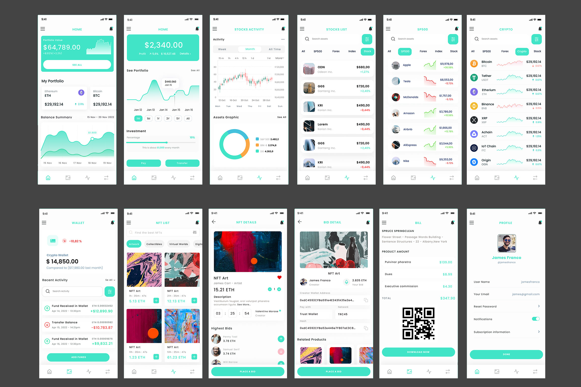
Clear Content Segmentation
Stocks, crypto, forex, indices, and NFTs are visually and structurally segmented to prevent cognitive overload. Each asset type has its own contextual filters, charts, and data presentation while maintaining a consistent navigation framework. This separation ensures that users understand the nature of the asset they are trading without disrupting the overall system coherence.
Modular Component Structure
The interface was built using a modular component system that maintains consistency across portfolio dashboards, asset lists, trading screens, wallet management, NFT marketplace views, and analytics sections. Reusable chart modules, asset cards, transaction summaries, and CTA patterns create a cohesive system that can scale as new financial instruments or features are introduced.
This modular foundation allows expansion into advanced trading tools, subscription tiers, analytics dashboards, and multi-wallet integrations without compromising usability.
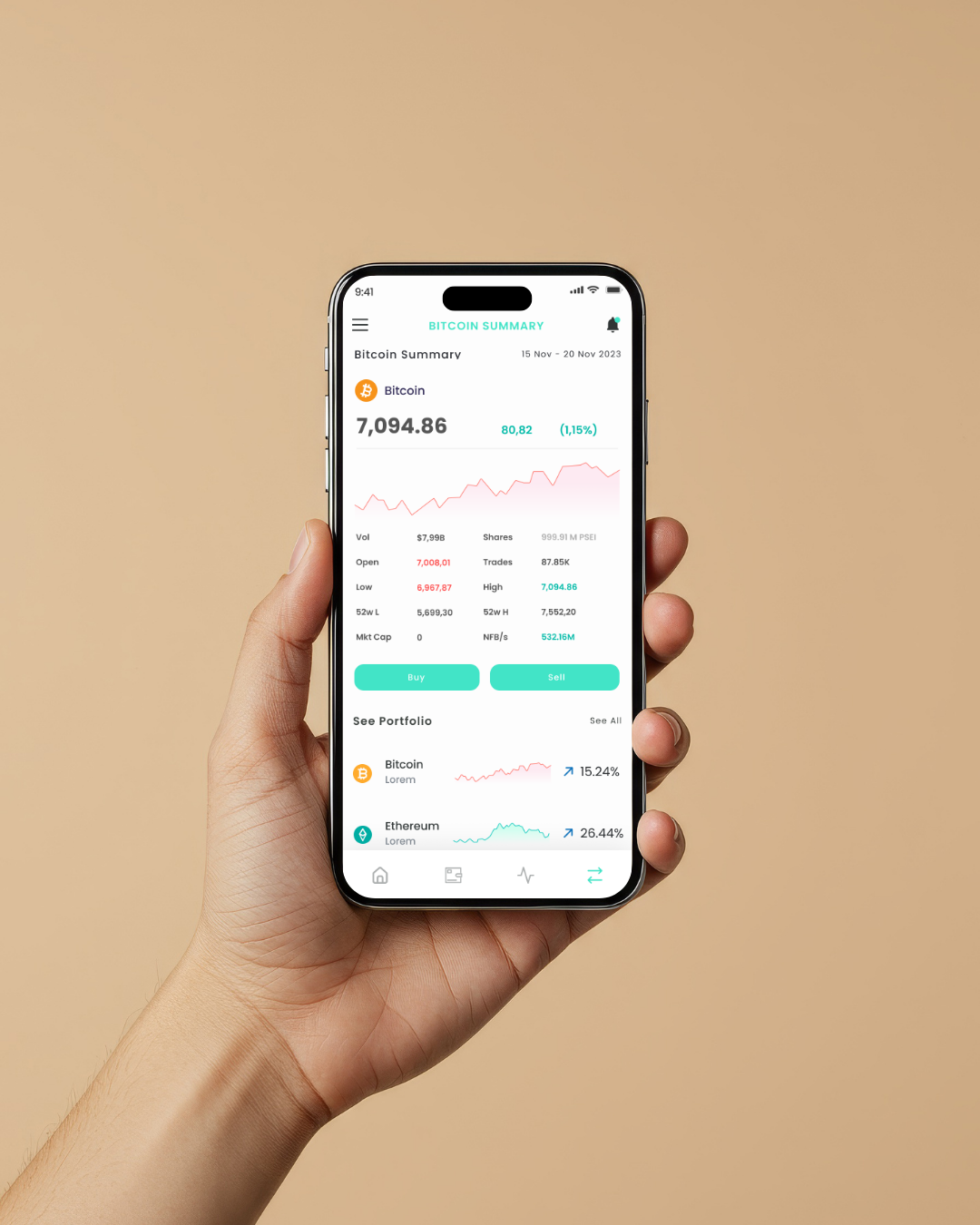
Performance-Driven Visual System
The visual language uses a balanced color system where green and red signals communicate performance shifts clearly without dominating the interface. Neutral backgrounds reduce visual fatigue while ensuring data contrast remains accessible and legible.
The design prioritizes clarity under data-heavy conditions, creating a calm but confident financial environment where users can make informed decisions without distraction.
