ZenFlow
Yoga & Meditation Mobile App
ZenFlow is a conceptual iOS mobile platform designed as an end-to-end product exploration in the wellness space. In this project, I worked as Product Designer, defining the UX strategy, information architecture, and full UI system to create a scalable ecosystem connecting users with yoga classes, meditation content, and instructors.
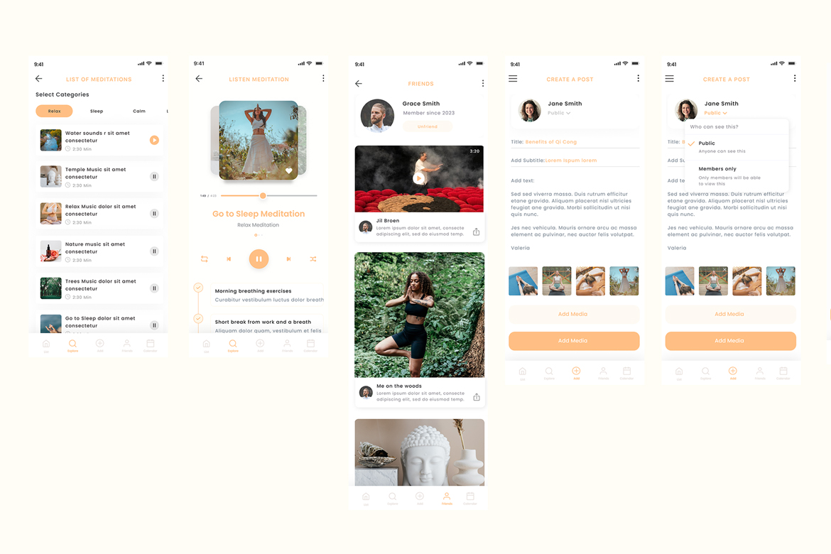
The platform integrates class booking, meditation audio streaming, instructor onboarding, community interaction, and content publishing within a single structured experience. The core challenge was to balance multiple feature layers — scheduling, on-demand content, and social engagement — without overwhelming users or compromising clarity.
The result is a modular, extensible mobile experience designed to support both practitioners and instructors while maintaining intuitive navigation and a calm, cohesive visual identity.
Creating a Unified Experience Across Classes, Meditation and Community Features
The Problem
Many wellness apps focus on a single core feature, whether that is meditation content, class booking, or community interaction. Very few platforms integrate all three within a clear and structured ecosystem. This often results in overloaded dashboards, poor separation between live sessions and on-demand content, complex booking flows, limited tools for instructors, and weak community engagement.
Design Goals
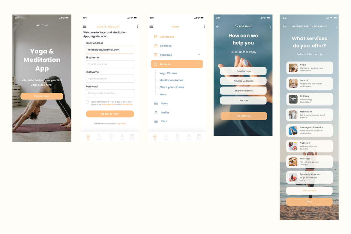
The main objective was to design a modular mobile structure capable of supporting multiple content types within a scalable system. The focus was on clearly separating live classes from on-demand content, reducing cognitive load through intuitive navigation, and building reusable UI components that allow future expansion. The platform was also designed to support both user and instructor journeys within the same ecosystem.
Target Users
The platform was designed around two core audiences. The primary user is a wellness-oriented individual who practices yoga regularly, consumes meditation content, and books sessions both online and in person. The secondary user is a yoga instructor who needs structured tools to publish classes, share content, and manage sessions efficiently within a digital environment.
Key User Flow:
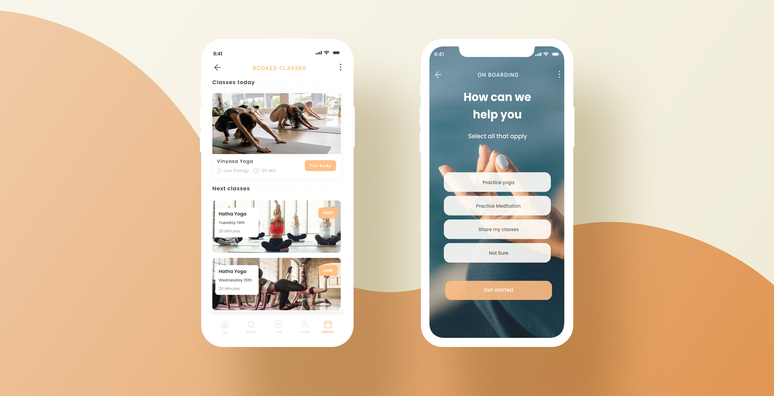
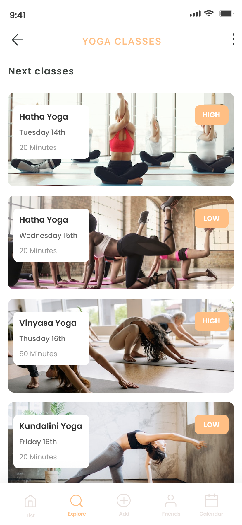
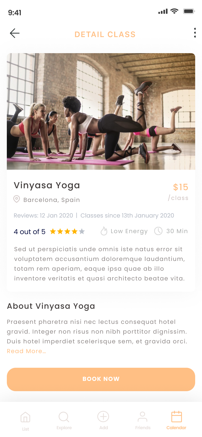
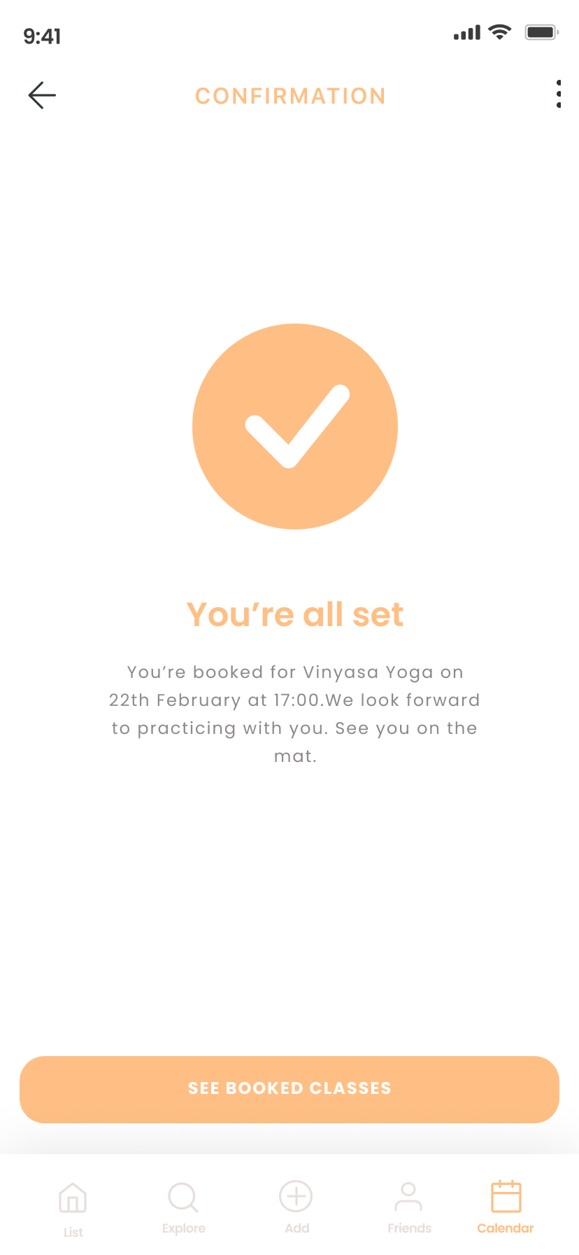
Booking a Class
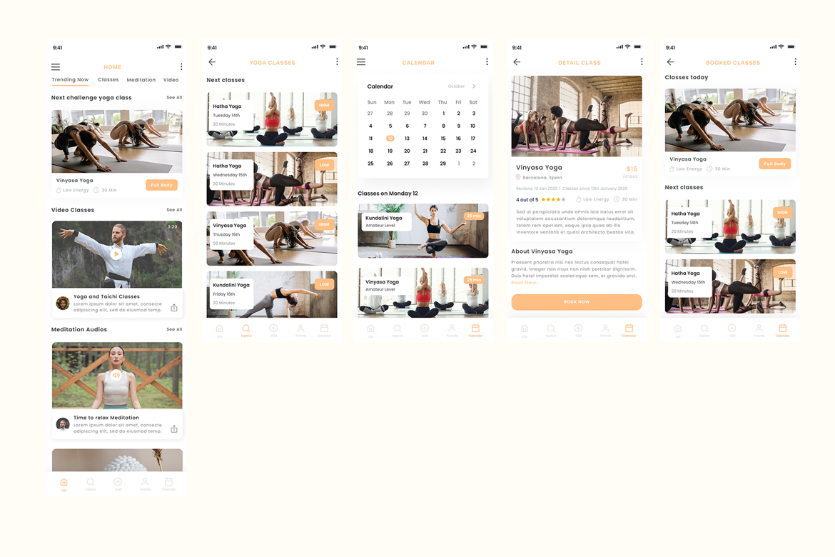
The booking experience was designed to guide users from discovery to confirmation in a clear and intuitive sequence: Home → Yoga Classes → Class Detail → Book Now → Calendar confirmation.
The flow prioritizes quick scanning through visible energy levels, duration, and ratings, while maintaining a strong CTA hierarchy and visual previews that support confident decision-making with minimal friction.
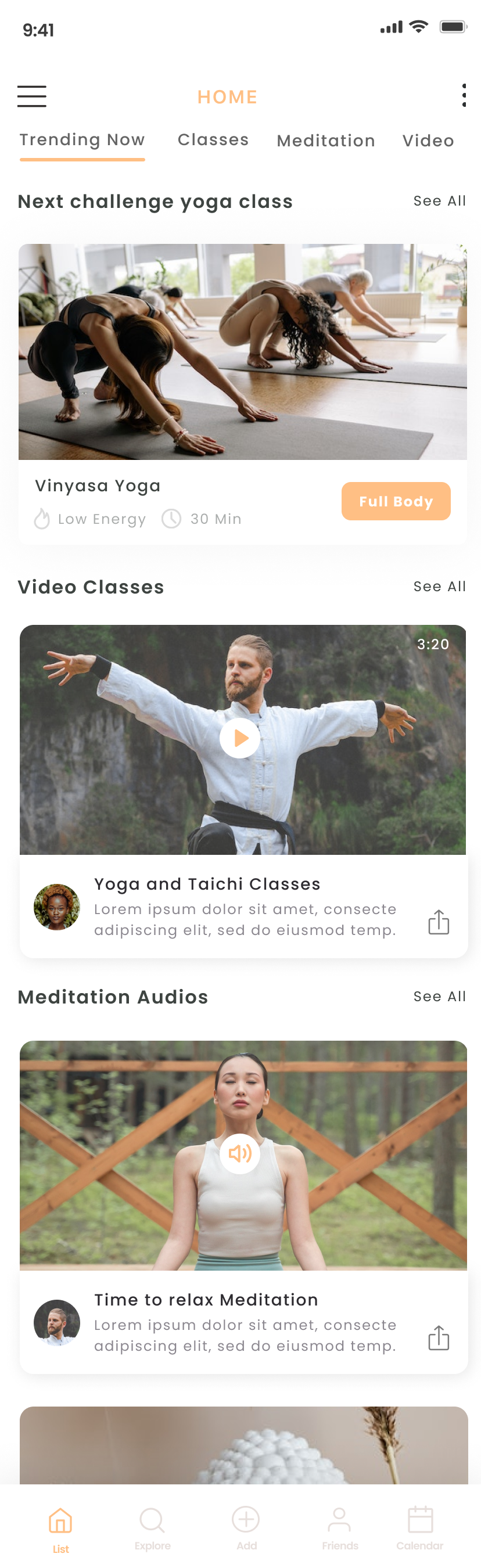
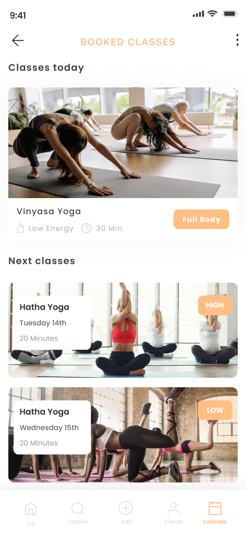
Clear Content Segmentation
Classes and meditation content are visually and structurally separated to prevent cognitive overload and reduce decision friction. Live sessions and on-demand experiences serve different user intentions, so the interface reflects this distinction through hierarchy, layout, and navigation patterns. This separation helps users immediately understand whether they are booking a scheduled class or consuming self-paced content, creating clarity within a feature-rich environment.
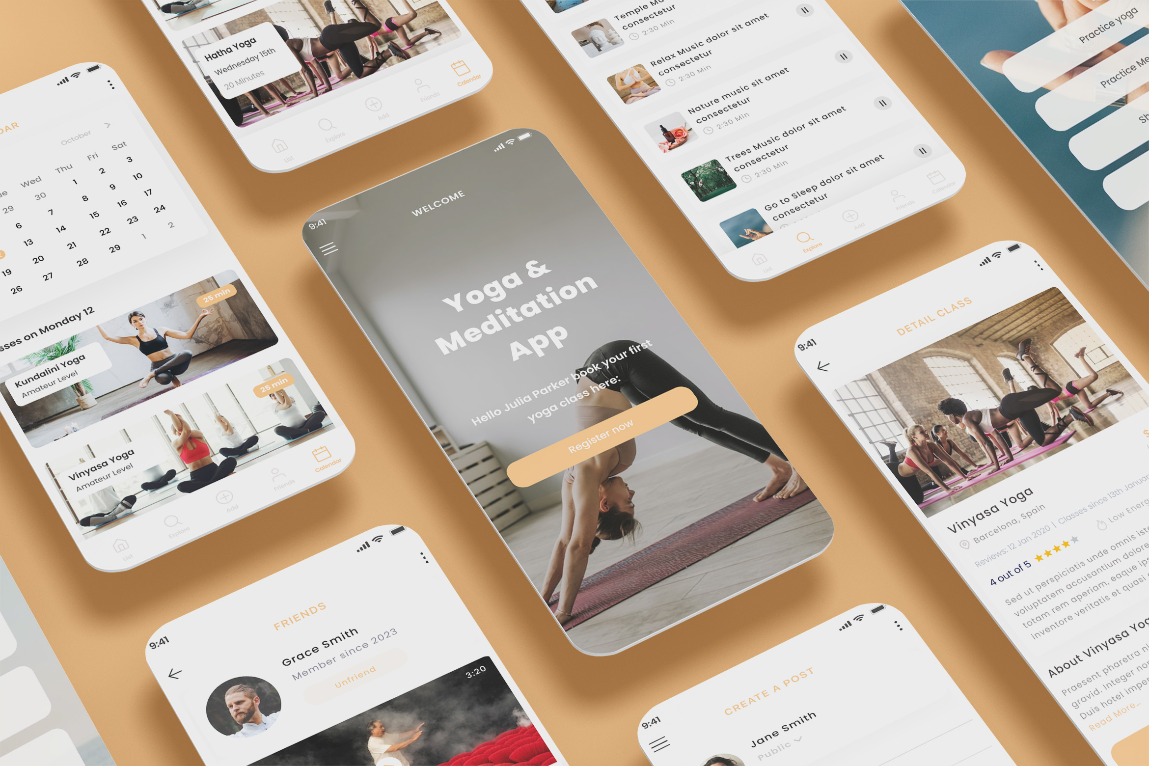
Modular Component Structure
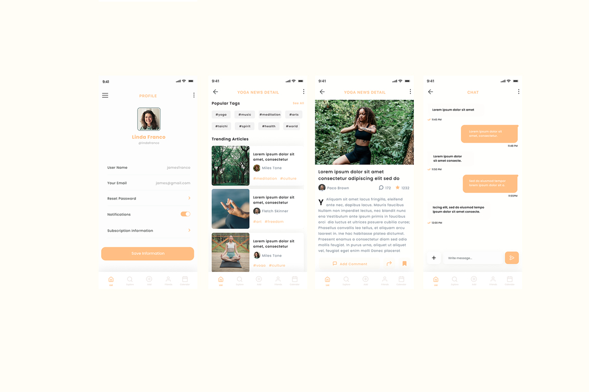
The interface was built using a modular component system designed to maintain consistency across different sections of the app, including classes, meditation content, news, and community features. By structuring layouts around reusable patterns, the design ensures visual coherence while allowing flexibility for future expansion. This modular approach supports scalability and simplifies the addition of new content types or features without disrupting the overall experience.
Soft Color System
The visual language is based on a warm, neutral color palette intended to evoke calmness and emotional balance. The tones were carefully selected to reduce visual fatigue during prolonged use while maintaining sufficient contrast for accessibility. The result is an interface that feels soft and inviting without compromising clarity or readability, aligning with the mindful nature of the product.
